in Poland
of loyalty program
across Poland
traded on Portuguese stock exchange
in Poland
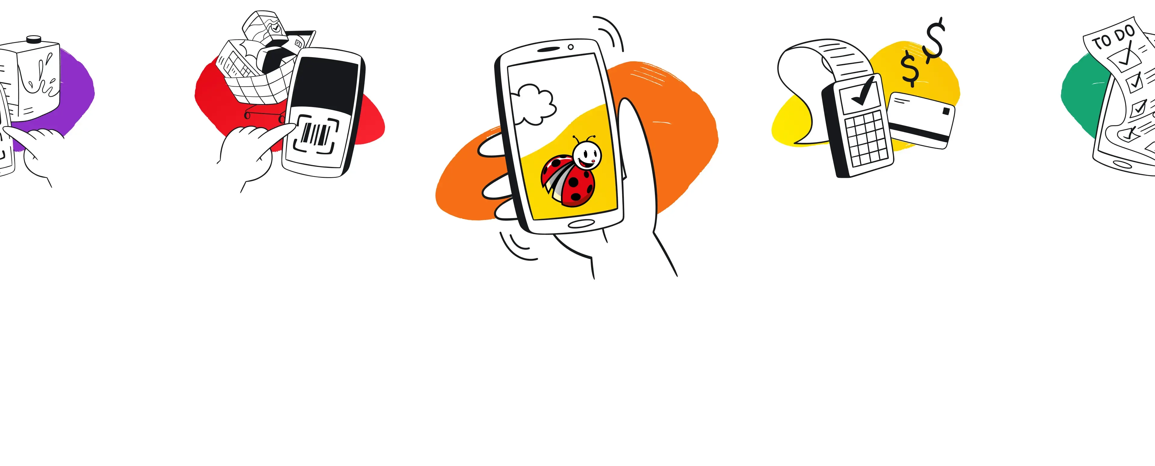
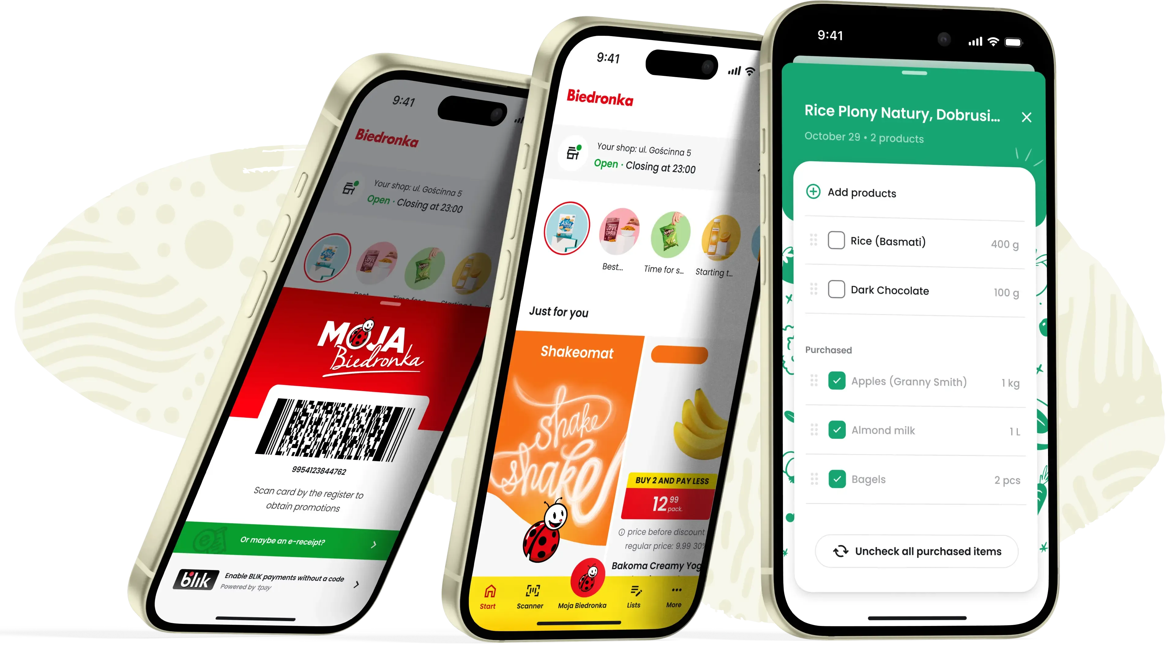
of Biedronka loyalty app
The initial release of the Biedronka app received positive feedback from users, highlighting the brand’s potential for mobile engagement. However, as the market became increasingly competitive, it became clear the app needed a redesign to stay relevant and appealing, especially to younger users.
With a vision to create a more attractive and accessible app, Biedronka decided to invest in a comprehensive design overhaul, and we were chosen as the right partner for this challenge.
We began with a comprehensive audit of the existing app. This initial phase involved examining elements such as the home screen, the login process, and overall user interactions. Our findings confirmed what we suspected – while the app was functional, it still had room for improvement in terms of usability and user experience.
The audit allowed us identify key focus areas: enhancing navigation, simplifying certain processes, and giving the UI a fresh facelift. In a workshop with Biedronka, we discussed these insights in detail, carefully considering priorities and needs. This collaborative approach helped us align our proposed improvements with the company's goals, setting a clear path forward for the project.
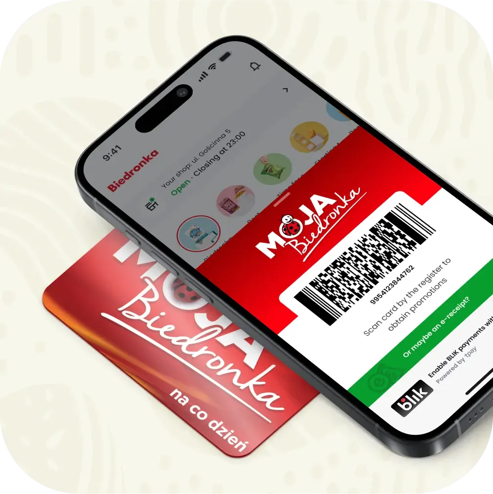
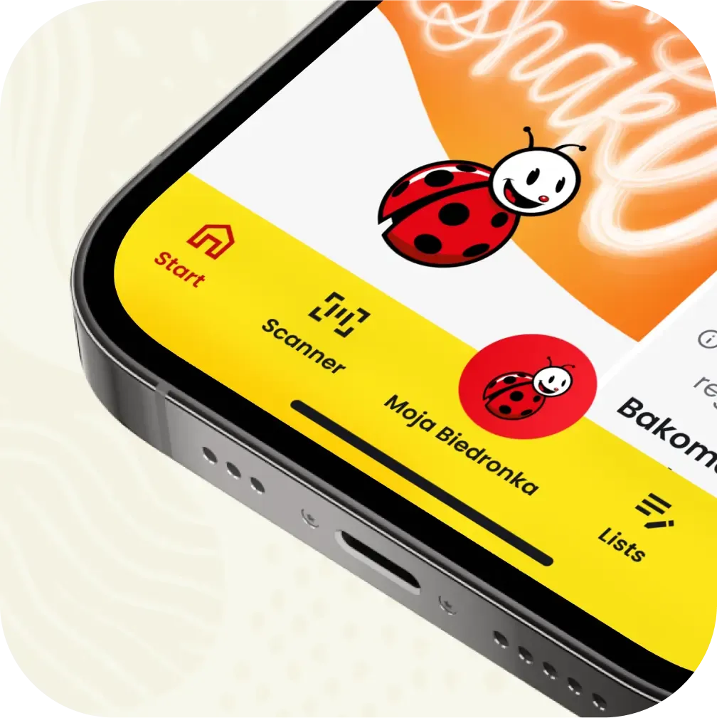
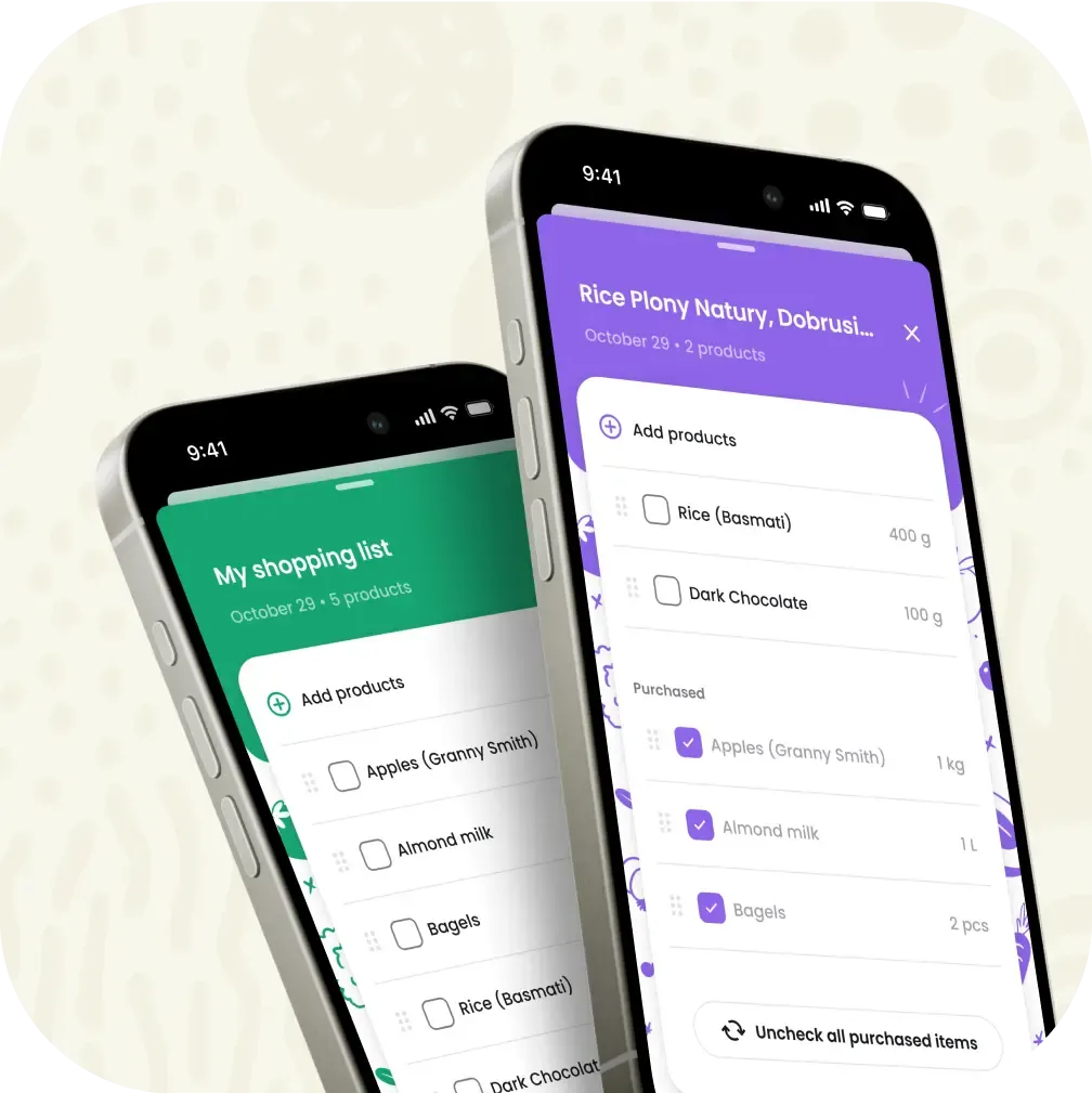
This allowed us to understand the user behavior and pinpoint areas that required improvement, such as navigation, login process, and overall user-friendliness of the product. We knew that the key to success lay in a balance between aesthetics and functionality. Our team of product designers collaborated closely to draw the main views of the new Biedronka app, focusing on key elements such as the home screen, offers section, and scanners.
We knew that the home screen was the gateway to the entire app experience. It had to be inviting, intuitive, and reflective of Biedronka’s brand identity. The offers section was another critical component, as Biedronka's promotions are a major draw for customers, and we wanted this section to be both visually striking and easy to browse. Meanwhile, the scanner functionality was essential for users who wanted to quickly access product information and prices.
We held frequent and detailed discussions with the Biedronka team to make sure our design decisions would drive the client’s business goals and desired brand perception. We debated even seemingly small details, but ones we knew could significantly affect user experience.
Throughout the entire process, we employed a customer-centered approach, focusing on consistent visual language, clean and modern design, and interactive elements aimed at enhancing user engagement and loyalty to Biedronka.
Biedronka quickly recognized the value of validating our assumptions with end-users for such a complex project. Consequently, our experts quickly began designing comprehensive research plans to gather the necessary insights.
We began with qualitative research, engaging a group of respondents in detailed one-on-one and dyad interviews, which allowed us to observe real user interactions and gather useful insights. These sessions highlighted key pain points and helped us understand issues that needed further focus in the following phase.
Armed with this qualitative data, we crafted a quantitative survey, which was distributed to approximately 1500 users. This larger dataset validated our findings and provided statistically significant insights. The survey helped us decide which direction should be prioritized in our design decisions to ensure intuitive navigation structure and meet user preferences.