x
x

global online travel agency
across 6 continents
“Redesigning our core web funnels and building a flexible Design System allowed us to make a strategic leap—transforming eSky from a transactional booking engine into an inspiration-driven, end-to-end travel platform across 50+ markets.”

eSky Group invited Future Mind to collaborate with the in-house design team to elevate brand's look and feel and enhance the user experience with a fresh perspective. The goal was not only to create visually compelling designs that convert – we also wanted to leave a lasting impression on customers with every visit.
Our combined team was excited to take on the challenge of redefining eSky’s digital presence. We got down to work, ready to transform the company’s digital channels into absolute showstoppers.
eSky was committed to incorporating fresh perspectives into the new look and feel, so we kicked off the project in a way that encouraged creativity and innovation. After analyzing existing designs, we organized joint workshops to explore potential user experience enhancements, including new features that would make product navigation easier and invite customers to explore eSky’s full offer.
This dynamic collaboration not only sparked innovative ideas but also provided valuable insights into our shared vision for the “wow effect” we aimed to achieve, allowing us to seamlessly transition into the execution phase.
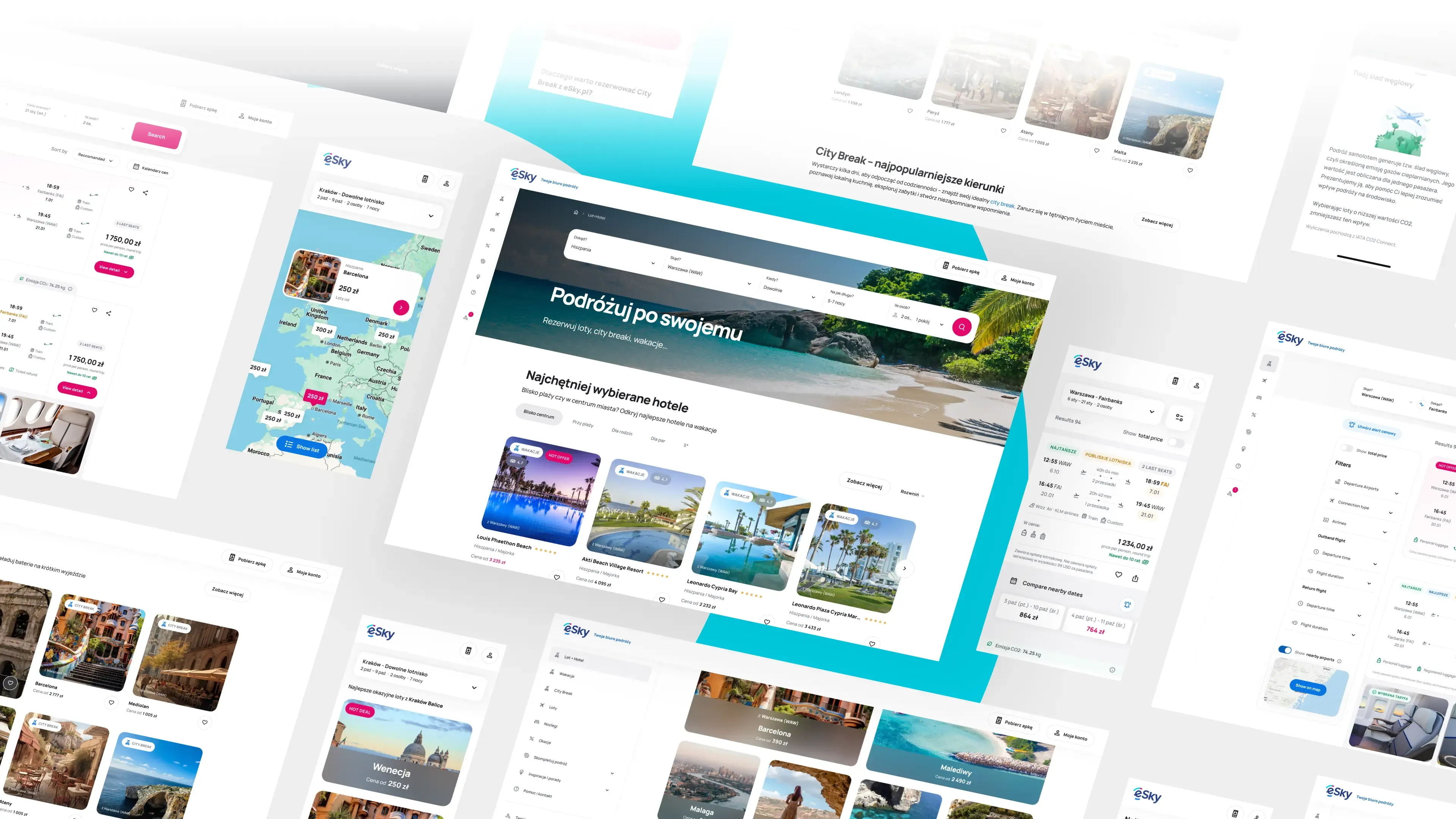
After a series of energetic and creative meetings, we struck gold: a sleek design blending eSky’s signature blue and pink with neutral tones, complemented by modern fonts and icons. We also embraced an innovative navigation structure, designed to streamline the user experience while setting the brand apart from its competitors.
The project aligned with the shift to Figma as the primary design tool, and we facilitated this transition by creating a well-structured, organized workspace within the platform. We populated with reusable components for web and mobile and styling guides and provided recommendations of how to create detailed documentation for key elements.
This approach streamlines the design process and generates cost and time savings of approximately 30%. It provided the in-house designers with a solid foundation to continue expanding the project while staying true to the established brand identity and design patterns.
Throughout the project, we made sure all designs were fully responsive, guaranteeing a seamless and user-friendly experience across all devices. We also created multiple variations of key screens, enabling the client to run regular A/B tests and further optimize the new design.
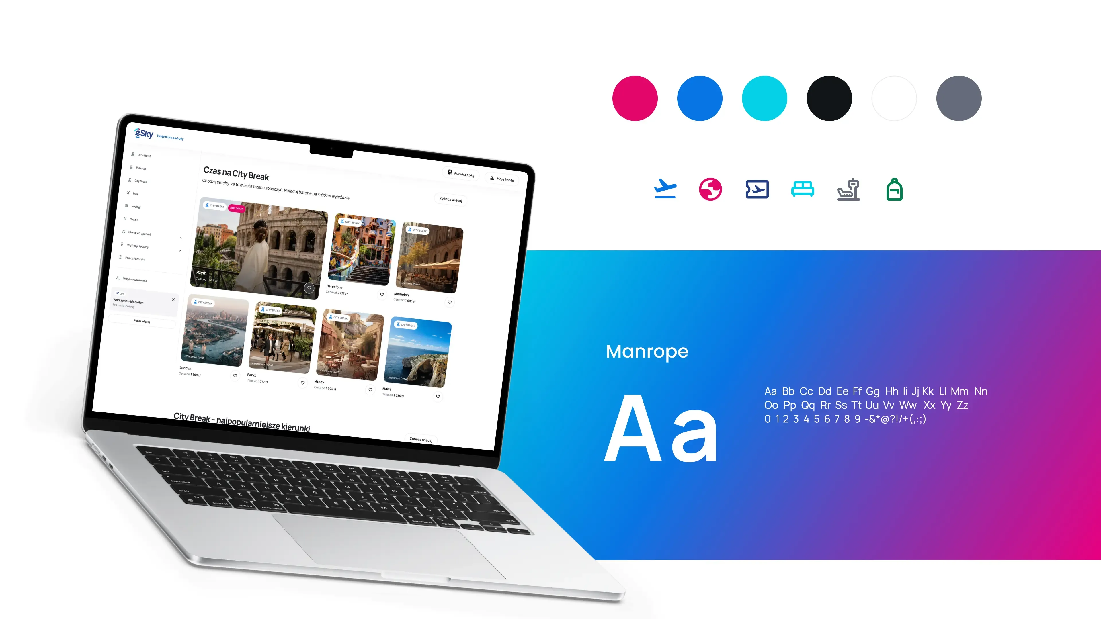
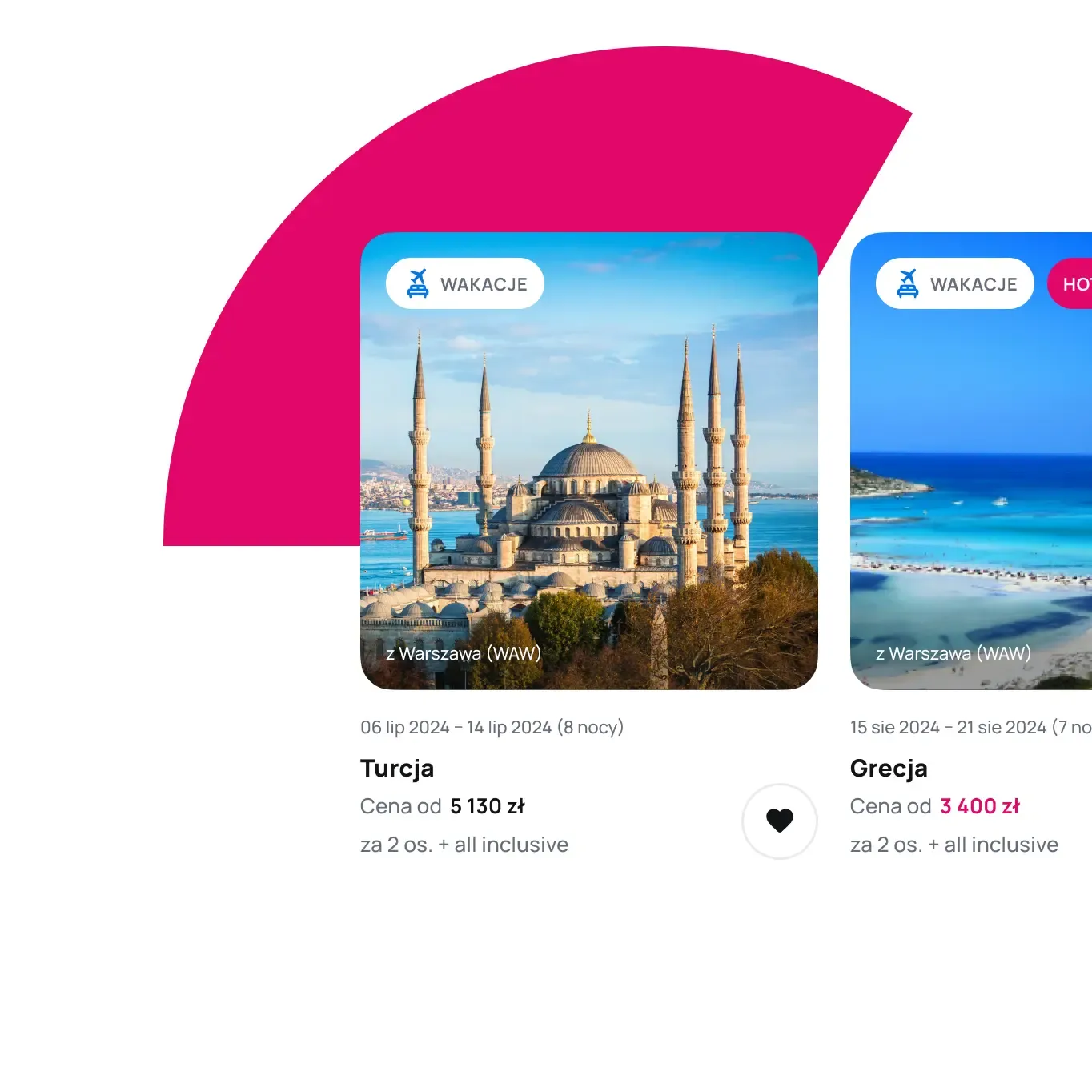
These channels, essential for driving revenue and serving as primary funnels for customer conversions, have been redesigned following industry best practices. The updated layouts seamlessly combine inspirational elements, like stunning visuals of dream travel destinations, with sleek, modern interfaces designed to simplify the booking process. The result is a streamlined, user-friendly experience that motivates users to pull the trigger on that dream holiday.